Overall Smoking Trend
In this study, we filtered the smokers from all respondents of the National Health Interview Survey and plotted graphs to observe the distribution of smokers by sex, age, and race groups.
Overall Smoking Trend from 2017 to 2020
#lets create a ggpplot
# ***task: try it to make it interactive soon....
#Problem: Should I use rate instead....???
smoke_trend_overall_plot = smoke_trend_overall %>%
  mutate(year = as.numeric(year),
         percentage = percentage*100) %>%
  ggplot(aes(x = year, y = percentage, group = smoking_status)) +
  geom_point(aes(color = smoking_status))+ geom_line(aes(color = smoking_status))+
 ggtitle("Overall Smoking Trend of the U.S in Recent 4 Years According to NHIS ")+
  labs(y = "Percentage", caption = "Data from National Health Survey")+
  transition_reveal(year)

animate(smoke_trend_overall_plot , renderer = gifski_renderer())
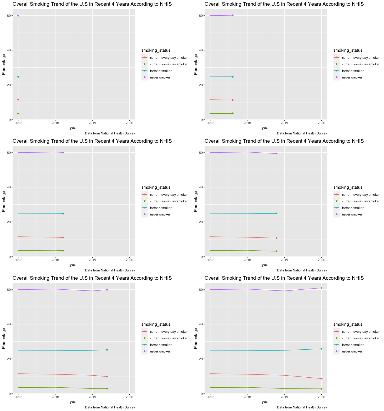
There is a slightly increase in the percentage of former smoker and never smoker from 2017 to 2020. The percentage of former smoker increased from 24.6% to 25.8%. The percentage of never smoker increased from 59.9% to 60.9%. Meanwhile, the percentage of current every day smoker and current some day smoker were slightly decreased by 2.0% and 0.7% respectively.
Overall Distribution of Smokers among Different Sex Groups from 2017 to 2020
#smokers' sex proportion
plot1 = bind_rows(a1,b1,c1,d1) %>%
  count(year, sex) %>%
  drop_na() %>%
  ggplot(aes(fill=sex, y=n, x=year))  +
    geom_bar(position="stack", stat="identity") +
    scale_fill_viridis(discrete = T)+
    labs(title = "The Distribution of smokers by sex over the 4 years",y = "Smoker sum", caption = "Data from National Health Survey")

ggplotly(plot1)
!!Interesting fact : The plot shows that there were more male smokers than female smokers every year of the past four years. In the past 4 years, it can be seen that the total sum of male smokers is higher that of female smoker.
Overall Distribution of Smokers among Different Age Groups from 2017 to 2020
#smoker's age proportion
bind_rows(a1,b1,c1,d1) %>%
  count(year, agegroup) %>%
  drop_na() %>%
  ggplot(aes(fill=agegroup, y=n, x=year))  +
    geom_bar(position="stack", stat="identity") +
    scale_fill_viridis(discrete = T)+
labs(title = "The Distribution of smokers by age group over the 4 years",y = "Smoker sum", caption = "Data from National Health Survey") 
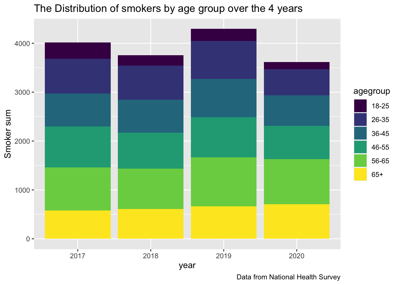
The age group 56-65 has the most smokers every year in the past four years. The age group 36-45 and 46-55 are slightly lower than 56-55 but worth noting as well. The age group 18-25 has the least smokers. There was little difference in the age distribution of smokers from 2017 to 2020. Smokers in the 18-25 age group showed a decrease after 2017. This is a good sign.
Overall Comparison of Smoking Proportion among People in Different Age, Sex, and Race Groups from 2017 to 2020
We compared the smoker proportion of each year among different age, sex, and race groups. The smoker proportion is obtained by diving the number of smokers to the total sum of people in the respective group.
#Plot 2020
plot4 = finding_smoking_dis(smoke_trend_2020)+labs(title = "Distribution of smoking among agegroup and race in year 2020", y = "proportion", caption = "Data from National Health Survey") + theme(axis.text.x = element_text(angle = 45, vjust = 0.5, hjust=1)) + theme(axis.text.x = element_text(size=5.5))

ggplotly(plot4)
In 2020, there is a high proportion of smokers in AIAN/ AIAN and any other group. Meanwhile, Asian group, especially female, has a comparatively low smokers’ proportion.
#Plot 2019
plot5 = finding_smoking_dis(smoke_trend_2019)+labs(title = "Distribution of smoking among agegroup and race in year 2019", y = "proportion", caption = "Data from National Health Survey") + theme(axis.text.x = element_text(angle = 45, vjust = 0.5, hjust=1))+ theme(axis.text.x = element_text(size=5.5))
ggplotly(plot5)
In 2019, the smoking proportion of male AIAN and other group is the highest in all age group except 65+.The smoker proportion in male AIAN and other group aged 56-65 is especially prominent, which reached to 48.3%, meaning that nearly half of the group are smokers. Meanwhile, Asian female has the lowest smoking proportion among all age groups.
#Plot 2018
plot6 = finding_smoking_dis(smoke_trend_2018)+labs(title = "Distribution of smoking among agegroup and race in year 2018", y = "proportion", caption = "Data from National Health Survey") + theme(axis.text.x = element_text(angle = 45, vjust = 0.5, hjust=1))+ theme(axis.text.x = element_text(size=5.5))
ggplotly(plot6)
In 2018, the smoker proportion in female AIAN aged 46-55 is especially prominent, which reached to 60%, meaning that more than half of the group are smokers. There is a slightly increasing trend in smokers’ proportion in female Black/African American along with the increase of age group between 18-25 to 56-65.
#Ploto 2017
plot7 = finding_smoking_dis(smoke_trend_2017)+labs(title = "Distribution of smoking among agegroup and race in year 2017", y = "proportion", caption = "Data from National Health Survey") + theme(axis.text.x = element_text(angle = 45, vjust = 0.5, hjust=1))+ theme(axis.text.x = element_text(size=5.5))

ggplotly(plot7)
In 2017, there is a comparatively low smoking proportion in both female and male Asian group among all age group.
Overall, the smoking proportion of Asians, especially females, is the least among age group.