Smoking During the Covid-19 Pandemic
We aim to look at the distribution of current smoker, former smoker, and never smoker among different subgroups defined by demographic characteristics, and if the proportion of current smoker with certain medical conditions decreases in 2020 comparing to 2019.
Sexual Orientation
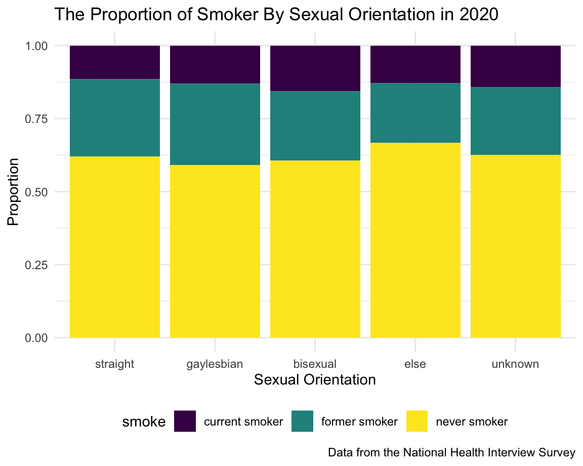
The table shows that the number of people with sexual orientation other than straight were extremely fewer than straight. Based on the graph, the proportion of smoker (current + former) within the gay/lesbian group was larger than straight; Bisexual people has the largest current smoker rate, which can be clearly seen in the graph.
orient_df =
  adult_smoke %>%
  filter(year == 2020) %>%
  filter(!orient %in% c("refused", "not ascertained","don't know")) %>%
  mutate(orient = fct_relevel(orient, "straight", "gaylesbian", "bisexual", "else", "unknown")) %>%
  group_by(orient, smoke) %>%
  summarise(n = n()) %>%
  group_by(orient) %>%
  mutate(sum_orient = sum(n)) %>%
  mutate(proportion = n / sum_orient)

orient_tb =
  adult_smoke %>%
  filter(year == 2020) %>%
  filter(!orient %in% c("refused", "not ascertained","don't know")) %>%
  mutate(orient = fct_relevel(orient, "straight", "gaylesbian", "bisexual", "else", "unknown")) %>%
  group_by(orient) %>%
  summarize(`Respondent Count` = n()) %>%
  mutate(
    `Sexual Orient` = recode(orient,
                    "straight" = "Straight",
                    "gaylesbian" = "Gay and Lesbian",
                    "bisexual" = "Bisexual",
                    "else" = "Something Else",
                    "unknown" = "Respondent Don't know"
    )
  ) %>%
  select(`Sexual Orient`, `Respondent Count`)

knitr::kable(orient_tb)| Sexual Orient | Respondent Count |
|---|---|
| Straight | 29147 |
| Gay and Lesbian | 570 |
| Bisexual | 407 |
| Something Else | 147 |
| Respondent Don’t know | 251 |
orient_df %>%
  ggplot(aes(x = orient, y = proportion, fill = smoke)) +
  geom_bar(position = "stack", stat = "identity") +
  labs(
    title = "The Proportion of Smoker By Sexual Orientation in 2020",
    x = "Sexual Orientation",
    y = "Proportion",
    caption = "Data from the National Health Interview Survey"
  )
Education
It is interesting to see that the proportion of either current smoker or former smoker decreased with the increase of education level.
education_df =
  adult_smoke %>%
  filter(year == 2020) %>%
  filter(!education %in% c("refused", "not ascertained", "don't know")) %>%
  mutate(
    education = ifelse(education %in% c("never attended/kindergarten only","grade 1-11","12th grade, no diploma","GED or equivalent"), "GED and below",
                       ifelse(education %in% c("high school graduate", "some college, no degree"), "high school graduate",
                              ifelse(education %in% c("associate degree: occupational...","associate degree: academic"), "associate degree",
                                     ifelse(education %in% c("bachelor's degree", "master's degree"), "bachelor's and master's degree", "professional and doctoral degree"))))
    ) %>%
  mutate(
    education = fct_relevel(education, "GED and below", "high school graduate", "associate degree", "bachelor's and master's degree", "professional and doctoral degree")
  ) %>%
  group_by(education, smoke) %>%
  summarize(n = n()) %>%
  group_by(education) %>%
  mutate(sum_education = sum(n)) %>%
  mutate(proportion = n / sum_education)

education_df %>%
  ggplot(aes(x = education, y = proportion, fill = smoke)) +
  geom_bar(position = "stack", stat = "identity") +
  labs(
    title = "The Proportion of Smokers By Education Level in 2020",
    x = "Education Level",
    y = "Proportion",
    caption = "Data from the National Health Interview Survey"
  ) +
  scale_x_discrete(labels = c("GED and \nbelow", "high school \ngraduate", "associate \ndegree", "bachelor's and \nmaster's degree", "professional and \ndoctoral degree"))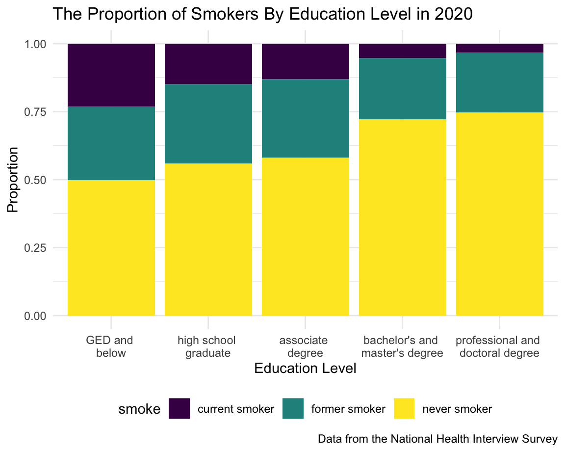
Race
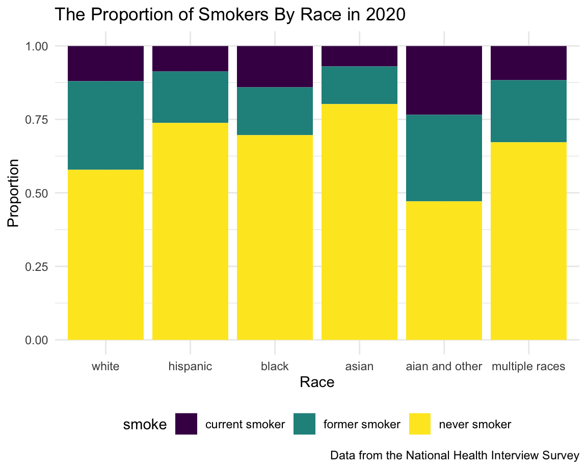
White people is the majority group in the U.S., and it is shown by the table. AIAN and Multiple Races only had a very small number of people. Based on the graph, AIAN has the highest smoking rate combining current smoker and former smoker, and the current smoker rate is worth noting. Asian has the lowest proportion of current smoker and former smoker.
race_df =
  adult_smoke %>%
  filter(year == 2020) %>%
  filter(!race %in% c("refused", "not ascertained", "don't know")) %>%
  mutate(
    race = recode(race,
                  "black or african american" = "black",
                  "aian" = "aian and other")
  ) %>%
  mutate(
    race = fct_relevel(race, "white", "hispanic", "black", "asian", "aian and other", "multiple races")
  ) %>%
  group_by(race, smoke) %>%
  summarize(n = n()) %>%
  group_by(race) %>%
  mutate(sum_race = sum(n)) %>%
  mutate(proportion = n / sum_race)

race_tb =
 adult_smoke %>%
  filter(year == 2020) %>%
  filter(!race %in% c("refused", "not ascertained", "don't know")) %>%
  mutate(
    race = recode(race,
                  "black or african american" = "black",
                  "aian" = "aian and other")
  ) %>%
  mutate(
    race = fct_relevel(race, "white", "hispanic", "black", "asian", "aian and other", "multiple races")
  ) %>%
  group_by(race) %>%
  summarize(`Respondent Count` = n()) %>%
  mutate(
    Race = recode(race,
                  "white" = "White",
                  "black" = "Black",
                  "hispanic" = "Hispanic",
                  "asian" = "Asian",
                  "aian and other" = "AIAN and Other",
                  "multiple races" = "Multiple Races")
  ) %>%
  select(Race, `Respondent Count`)

knitr::kable(race_tb)| Race | Respondent Count |
|---|---|
| White | 21753 |
| Hispanic | 3734 |
| Black | 3094 |
| Asian | 1651 |
| AIAN and Other | 423 |
| Multiple Races | 324 |
race_df %>%
  ggplot(aes(x = race, y = proportion, fill = smoke)) +
  geom_bar(position = "stack", stat = "identity") +
  labs(
    title = "The Proportion of Smokers By Race in 2020",
    x = "Race",
    y = "Proportion",
    caption = "Data from the National Health Interview Survey"
  )
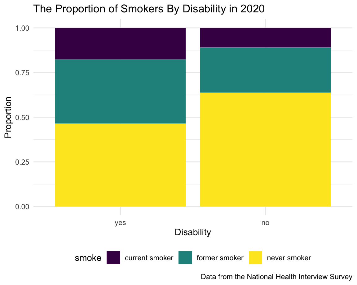
Disability
People with disability is considered as a minority group in the U.S. Based on the graph, the proportion of either current smoker or former smoker are significantly larger than people without disability.
disability_df =
  adult_smoke %>%
  filter(year == 2020) %>%
  filter(disability != "don't know") %>%
  mutate(disability = fct_relevel(disability, "yes", "no")) %>%
  group_by(disability, smoke) %>%
  summarize(n = n()) %>%
  group_by(disability) %>%
  mutate(sum_disability = sum(n)) %>%
  mutate(proportion = n / sum_disability)

disability_df %>%
  ggplot(aes(x = disability, y = proportion, fill = smoke)) +
  geom_bar(position = "stack", stat = "identity") +
  labs(
    title = "The Proportion of Smokers By Disability in 2020",
    x = "Disability",
    y = "Proportion",
    caption = "Data from the National Health Interview Survey"
  )
Specific Medical Conditions
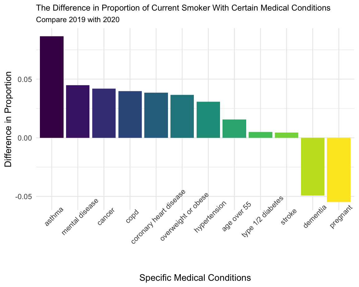
We selected the variables based on the instruction by CDC. People with these medical conditions are more likely to get severe Covid-19. Since smoking would weaken their immune system, making them harder to defend diseases, the proportion of current smoker should have decreased in 2020. The graph shows the difference in proportion of current smoker with certain medical conditions comparing 2019 to 2020. Specifically, we subtracted the proportion in 2020 by 2019, thus, we expected to see a graph with positive values.
People with asthma has the highest decrease in proportion of current smoker; People with diabetes and stroke has very few changes in the proportion of current smoker; The proportion of current smoker with dementia and pregnancy increased in 2020, which worth noting.
cancer_df = cancer_df %>% mutate(disease = "cancer")
asthma_df = asthma_df %>% mutate(disease = "asthma")
copd_df = copd_df %>% mutate(disease = "copd")
heart_disease_df = heart_disease_df %>% mutate(disease = "coronary heart disease")
hypertension_df = hypertension_df %>% mutate(disease = "hypertension")
mental_df = mental_df %>% mutate(disease = "mental disease")
bmi_df = bmi_df %>% mutate(disease = "overweight or obese")
dementia_df = dementia_df %>% mutate(disease = "dementia")
diabetes_df = diabetes_df %>% mutate(disease = "type 1/2 diabetes")
stroke_df = stroke_df %>% mutate(disease = "stroke")
preganant_df = preganant_df %>% mutate(disease = "pregnant")
age_df = age_df %>% mutate(disease = "age over 55")

difference_df =
  rbind(cancer_df, asthma_df, copd_df, heart_disease_df, hypertension_df, mental_df, bmi_df, dementia_df, diabetes_df, stroke_df, preganant_df, age_df) %>%
  select(year, disease, smoke, n, sum, proportion) %>%
  filter(smoke == "current smoker") %>%
  select(year, disease, proportion) %>%
  pivot_wider(
    names_from = year,
    values_from = proportion
  ) %>%
  mutate(
    prop_diff = `2019` - `2020`
  ) %>%
  select(disease, prop_diff) %>%
  mutate(
    prop_rank = min_rank(desc(prop_diff))
  )

difference_df %>%
  mutate(
    disease = fct_reorder(disease, prop_rank)
  ) %>%
  ggplot(aes(x = disease, y = prop_diff, fill = disease)) +
  geom_bar(stat = "identity") +
  labs(
    title = "The Difference in Proportion of Current Smoker With Certain Medical Conditions",
    subtitle = "Compare 2019 with 2020",
    x = "Specific Medical Conditions",
    y = "Difference in Proportion"
  ) +
  theme(axis.text.x = element_text(angle = 45),
        plot.title = element_text(size = 10),
        plot.subtitle = element_text(size = 9),
legend.position = "None") 